2021
Opportunity
Commercial vehicles are the main source of revenue for Ford in Europe.
Many of those vehicles must be converted to different needs; refrigerated vans, racking solutions, lifting equipment, and others.
The conversions specifications were captured by Ford dealers, through phone and email, then shared with the converters, making it difficult for everyone to keep track of different orders, and to see what status they were in.
Goals
Create a commercial vehicle platform for Ford to increase sales of commercial vehicles and simplify the process to convert a vehicle.
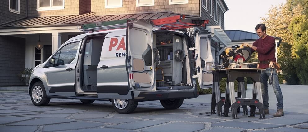
Ford Transit Connect with a racking system installed
Team
The design team consisted of 5 Product Designers which I led. We collaborated at different stages of the process.
On the client side, we mainly collaborated with stakeholders from Ford’s UK head office.
Internally, we also worked closely with front-end, back-end, and QA teams to ensure alignment throughout the project.
My role
- Led the experience strategy and design for Ford’s new commercial conversion platform as UX Manager
- Ensured a balance between business goals and user needs (customers, dealers, and converters)
- Oversaw user research activities, including workshops, interviews, and usability testing
- Maintained high quality standards for all deliverables, aligning outcomes with both internal and client expectations
User types
The platform is meant to be used by:
- Customers that require conversion of their new commercial vehicle
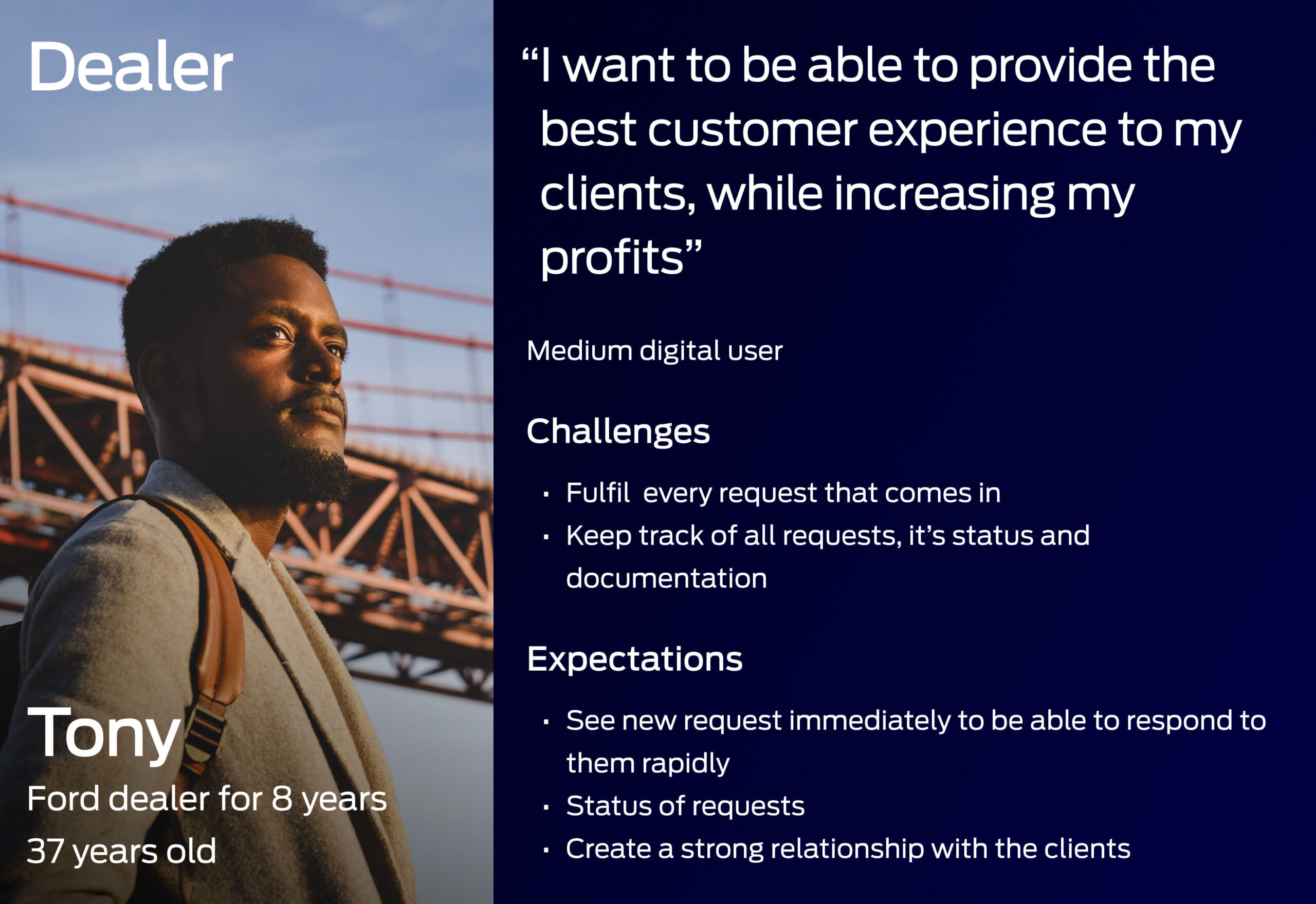
- Dealers that will manage the orders
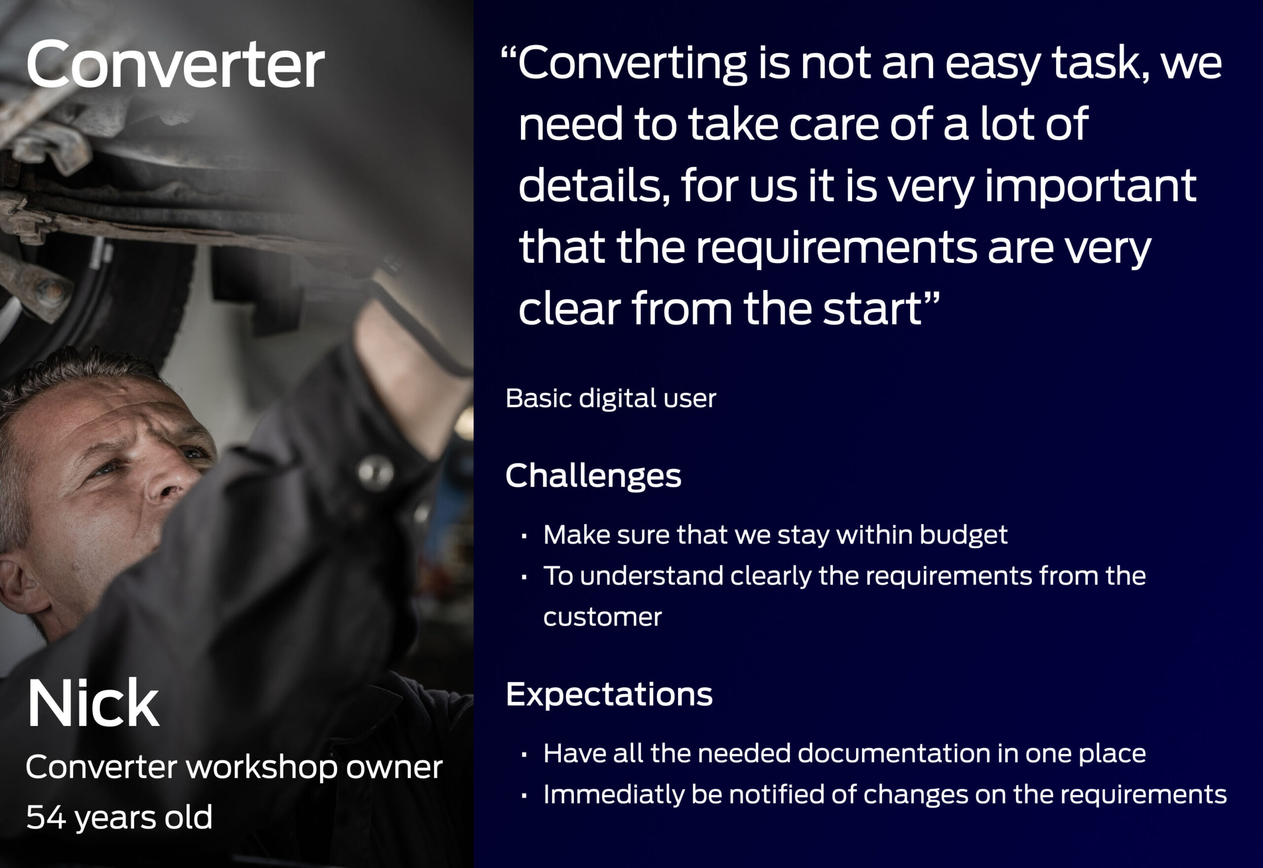
- Converters that will adapt the vehicle to the customer requirements
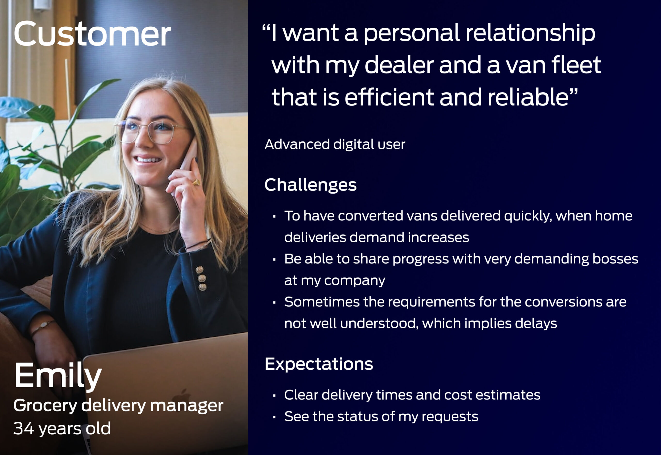
Personas
Workshops
I led the team in conducting a series of workshops with the stakeholders to be able to identify the needs, blockers, and opportunities.
From those workshops, we were able to define what would be the necessary features for each user type, the steps from when a request is created until a converted vehicle is delivered to the client, and the overall process.
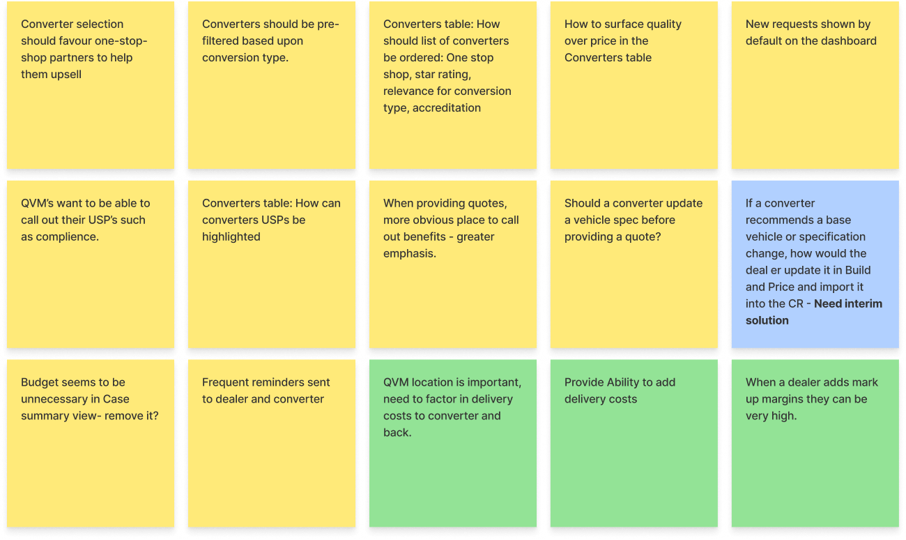
Notes from workshops
User flows
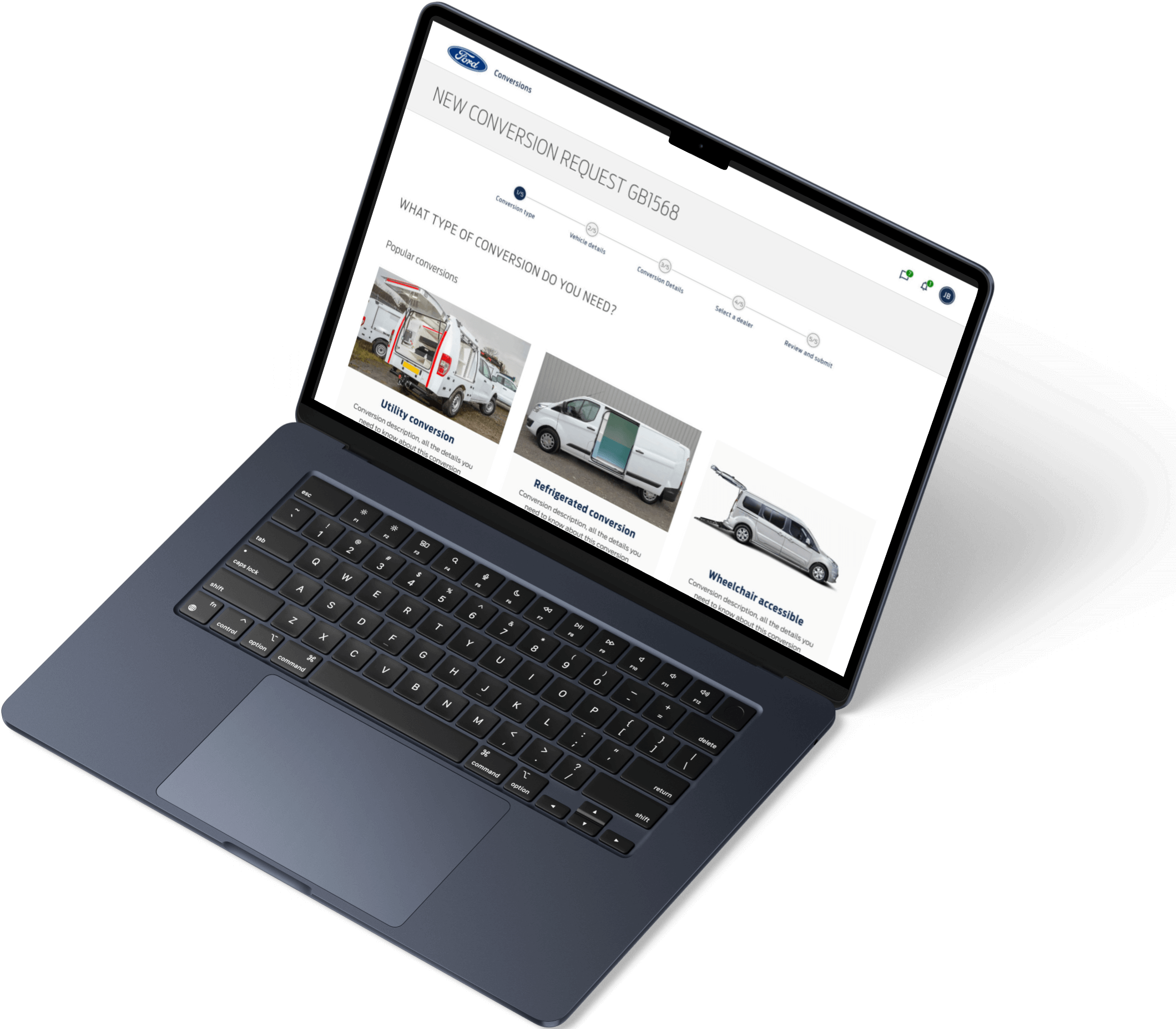
From the workshops we got the necessary information to be able to create the different user flows, when using the app.
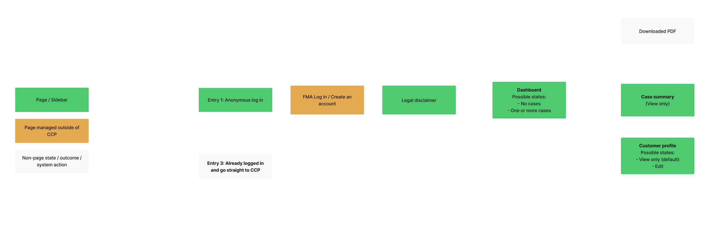
One of the user flows created
Interviews and usability testing
A series of remote user interviews and usability tests were conducted, engaging key user groups, including customers, dealers, and converters.
These sessions provided a wealth of valuable insights into user behaviors, preferences, and pain points. The feedback gathered informed critical design decisions, enabling the team to address specific needs and enhance the overall user experience. By incorporating these findings into the design process, the final product was better aligned with the expectations and requirements of its diverse audience.
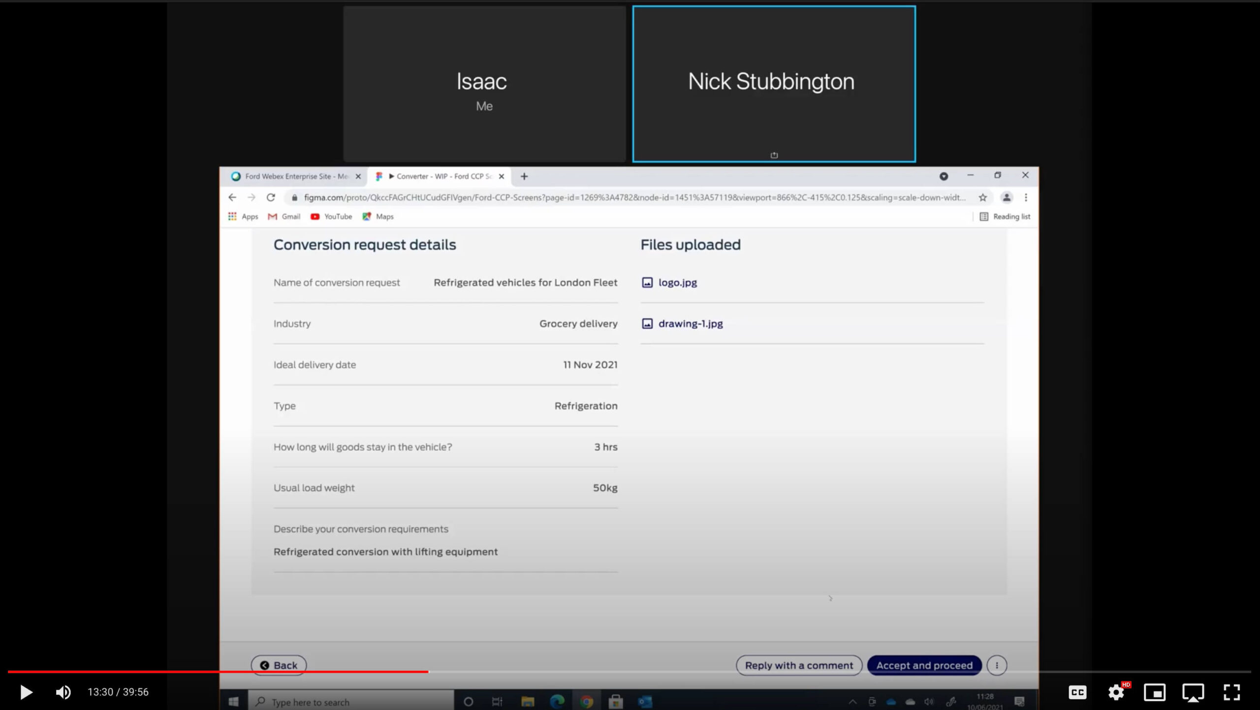
Screen capture of one of the recorded sessions with a commercial conversion manager
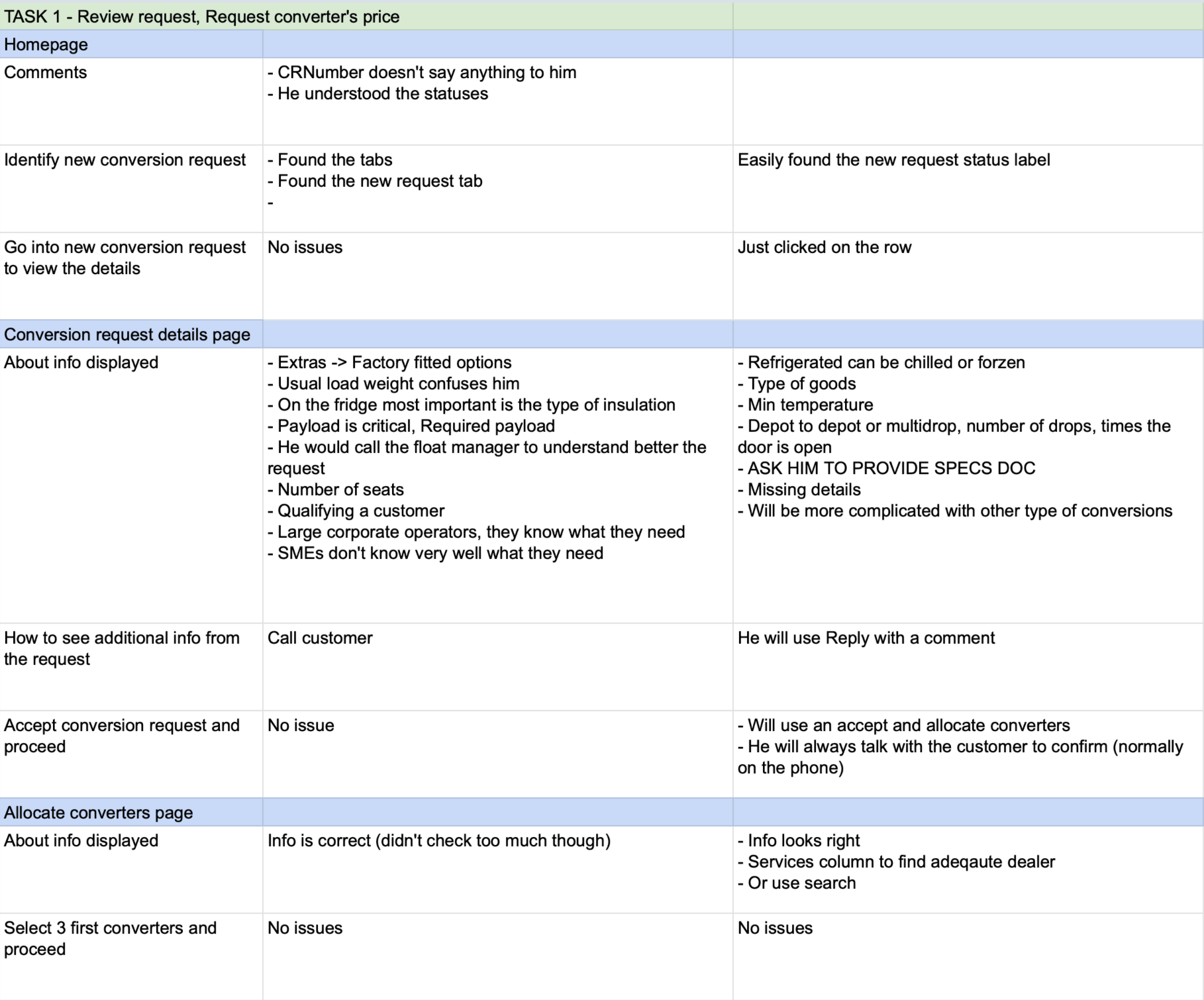
Comments from the interviews
Components
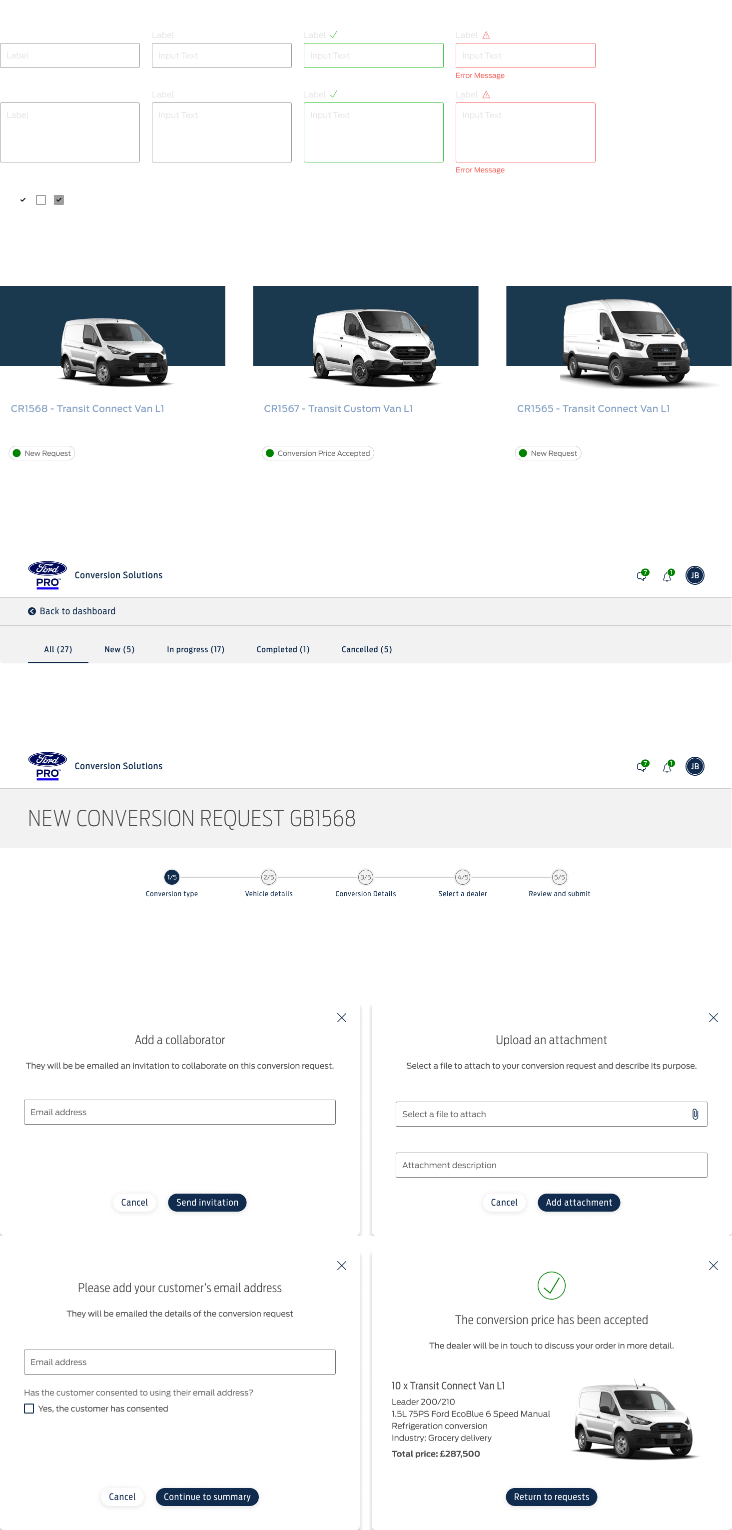
Based on Ford's visual identity used in its digital products, we started creating the main components in Figma while working on the concepts. This allowed us to move faster as the project progressed as many of those components were used in multiple screens of the project.
Creating those components early on also ensured consistency across the project.
Designs
The initial focus was to release on desktop and tablet based on the current usage, having a mobile version to be developed in the future.
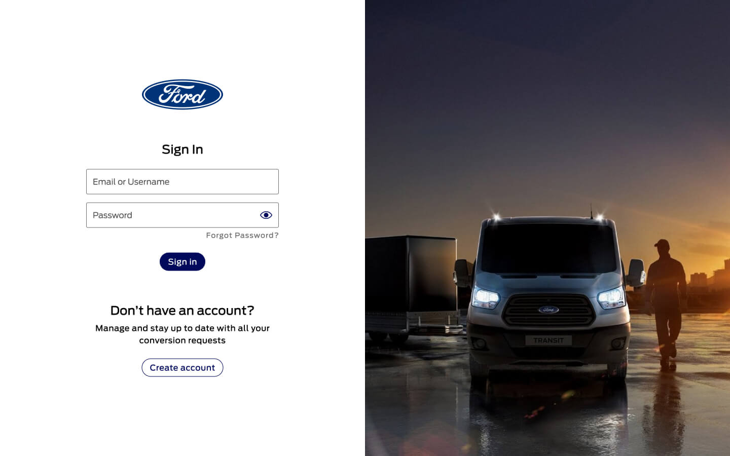
Sign in
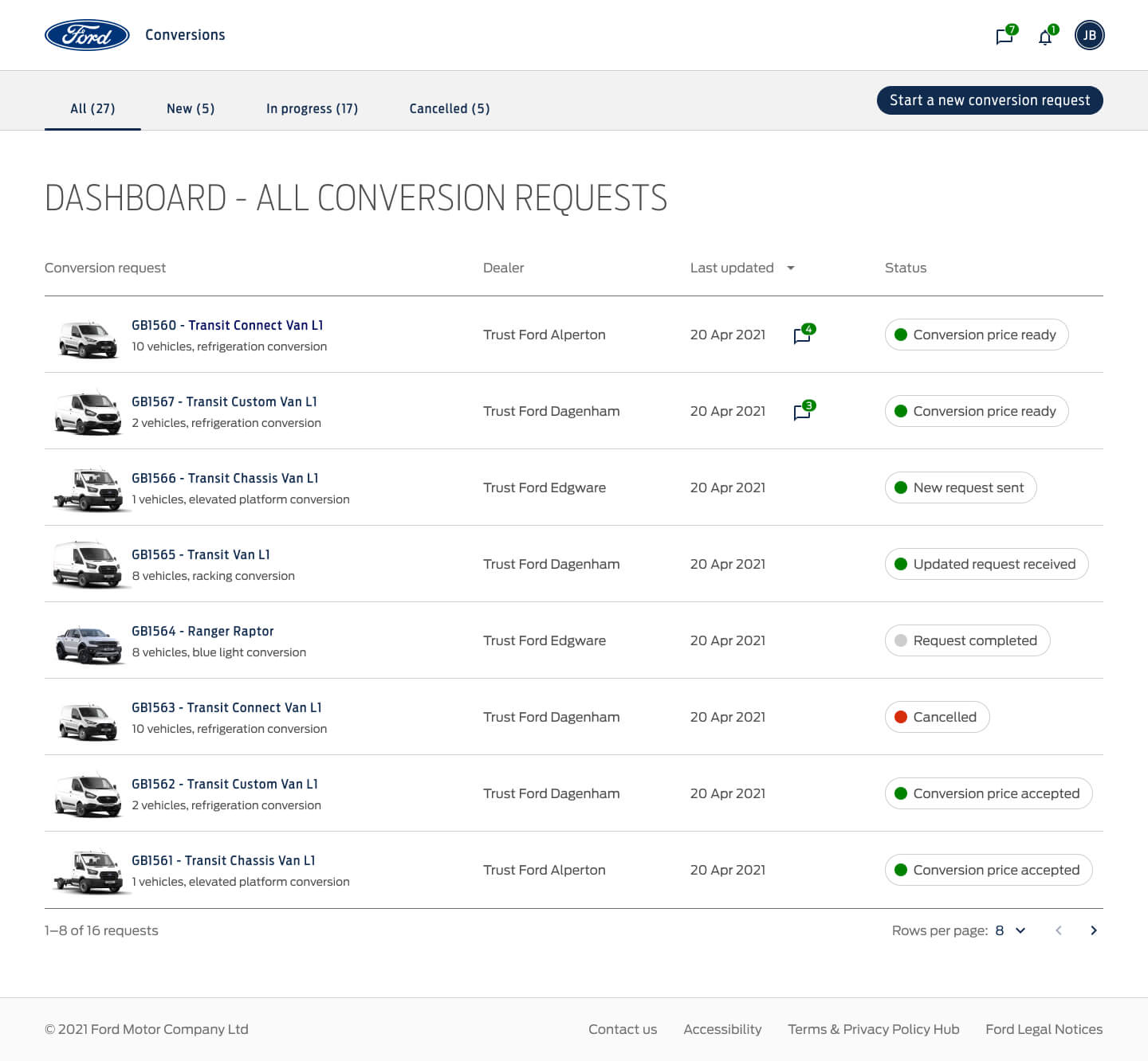
Dashboard showing conversion requests
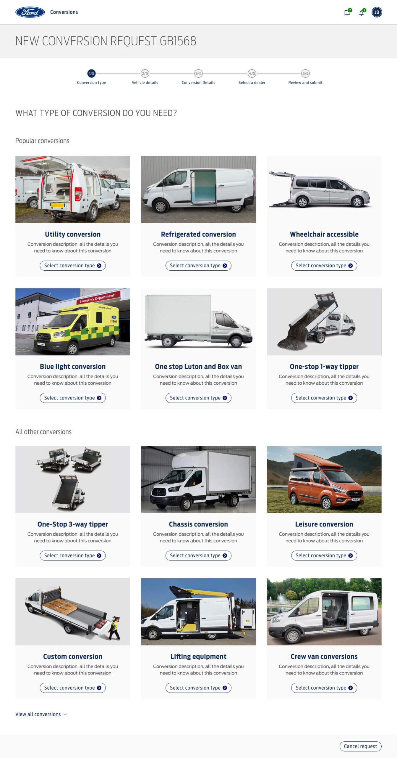
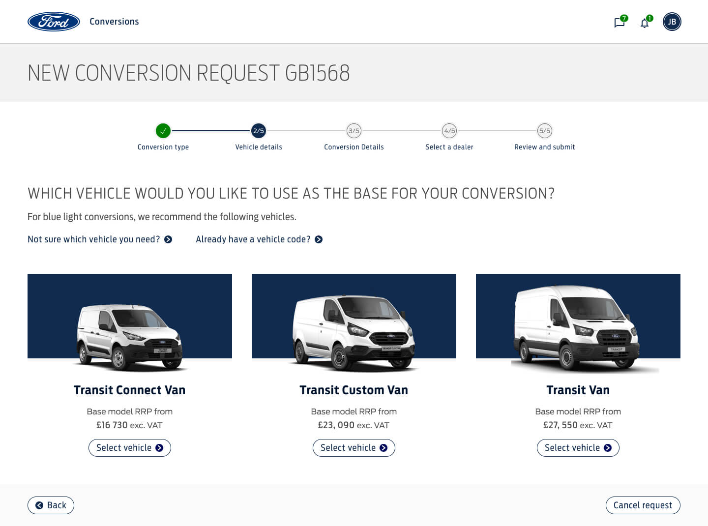
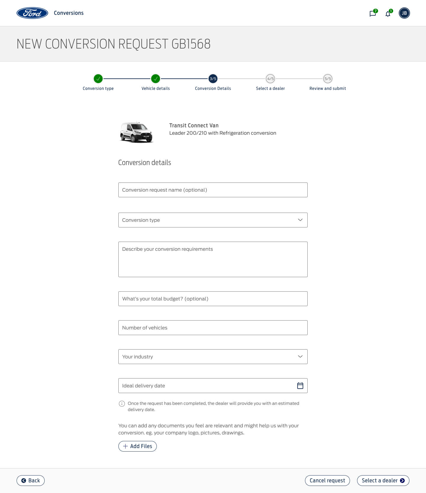
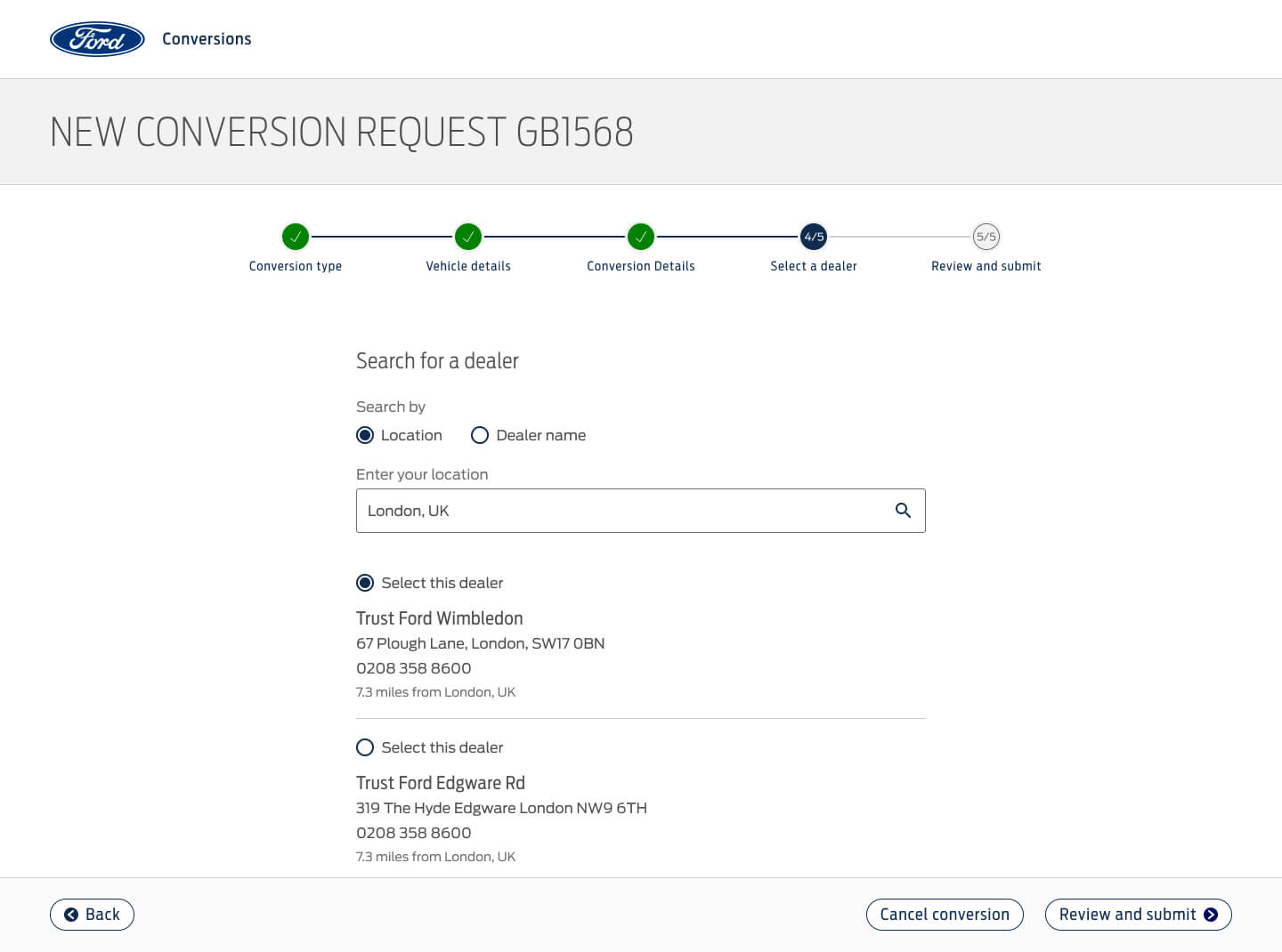
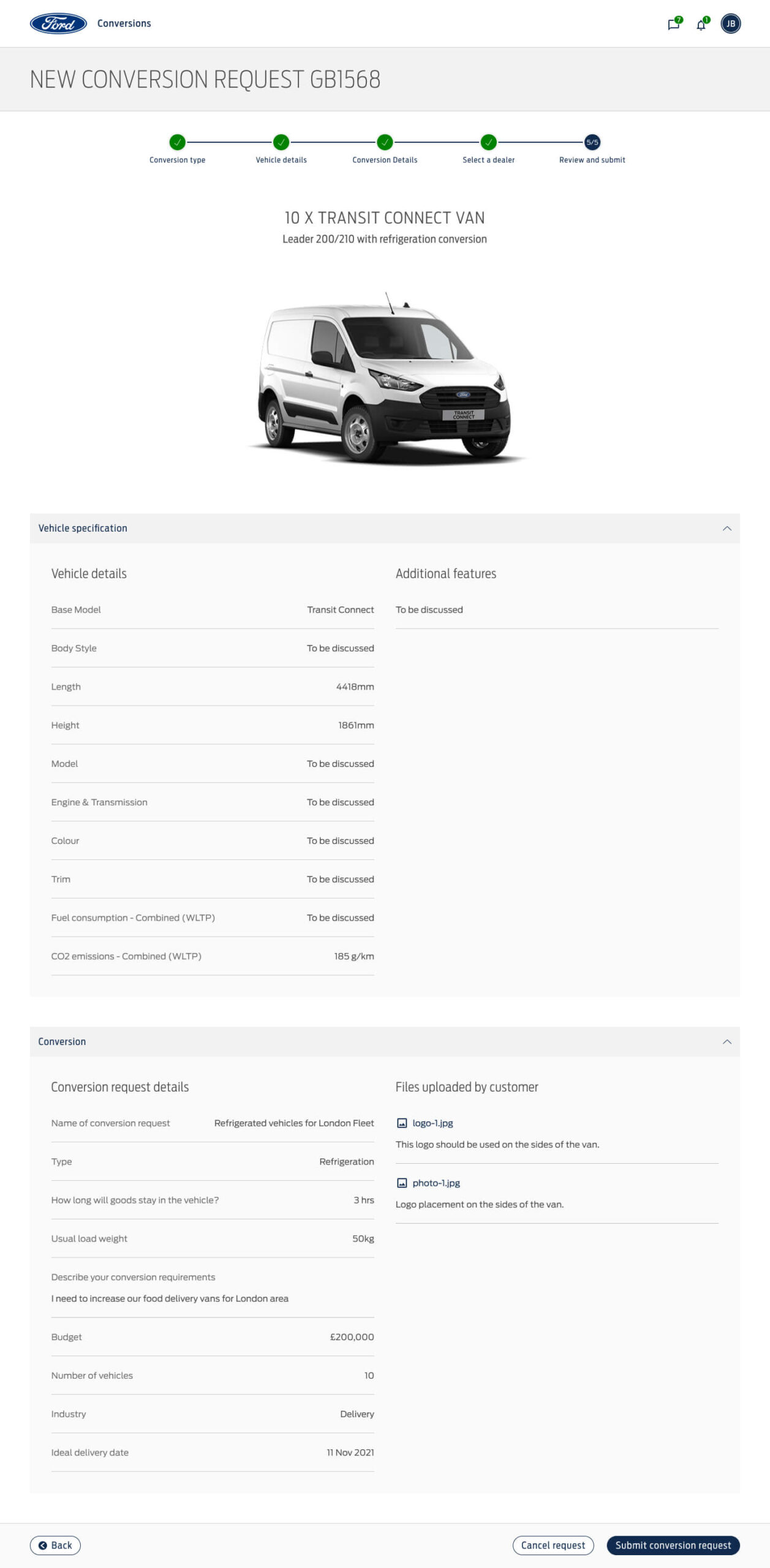
New conversion request flow
Final thoughts
Leading the design for the conversion platform project was challenging as there were many different parts involved, also it's a product that serves three types of very different user needs.
Although it was challenging, it was also really rewarding to see it come together in a short period, while seeing the team thrive, and do the best to deliver.

Isaac Vigil © 2025
